Sun Kitchen Mosaic Backsplash

It was so much fun to have the honor of making this brilliant, Gaudi-inspired showpiece for a client’s home! 

My clients were building their dream pool house which was sleak, modern and minimal. It is a gorgeous home with clean lines and almost all white. They planned on doing a lot of entertaining, so they wanted a bright, bold mosaic backsplash in their open kitchen to be the centerpiece of the dining and living area. I was so fortunate that the president of an arts organization I do work for are neighbors and friends with the couple building the home. The wife told the couple about my mosaic work and we met to discuss the project.

The couple wanted something inspired by Gaudi because they loved his mosaics and wanted a special artwork to remind them of their travels to Barcelona. They also wanted cobalt contrasting with vibrant, warm colors. It’s so rare people are bold enough to put this much color in their home, so it was such a joy to work with them to make this mosaic happen.

I wanted to create a design that would match their Gaudi & color specifications while still reflecting my own style. I suggested a sun because Gaudi has made mosaic suns, but I did it my way by using geometric shapes, different levels of translucency in the glass, colored mirror, and gold smalti. I didn’t even anticipate the gorgeous reflection of the sun on the stovetop. That was a happy coincidence. For the background we wanted something swirling and magical, so I created crisp lines between the cobalt that would transition through other blues and greens before coming back to cobalt. They wanted more red and movement in the design, so I added in the red sections to reflect the movement of the background.

I also suggested to create the mosaic out of glass instead of ceramic. I was so happy they agreed because I couldn’t have created a work this intricate out of ceramic. It would also lack the shine and impact. I still used a picasiette-style andamenton traditional of ceramic mosaics to pay homage to Gaudi. The whole design and choice of glass came together beautifully and quickly because the clients were open to ideas but also knew exactly what they wanted when they saw it. It was a wonderful collaboration.

Casa de Los Robles Mosaic

I loved making this plaque for a client’s home using stained glass and 24 karat gold smalti.

It was such an honor to get to make this beautiful plaque for my client’s home. She wanted something elegant to honor her home, Casa de Los Robles (House of the Oak), that was built in 1927.

A major feature of this mosaic is the gold smalti, which is 24 karat gold leaf between layers of glass. This beautiful and coveted glass comes from the Orsoni glass company in Venice, Italy. I had the idea of working with gold smalti and the client loved it, but then we were left with the dilemma that she definitely wanted the “de” to be placed in the tree trunk. I could have used dark gold smalti for the background and yellow gold to stand out in the tree, but I personally feel that using different colors in font is less elegant. The USA supplier of the gold at the time didn’t have this darkest of colors that had a certain refraction that allowed it to stand out against both dark brown and cream glass. Fortunately, when I relayed the significance of this particular color, the supplier managed to either find some stashed away or get some from Italy before her regular shipment, which would have been several months if the factory even had any in stock. To me, this color totally makes the mosaic work, so I was elated.

Then I had to sculpt this thick glass using andamento that keeps the script lettering light and consistent. Instead of recessing this glass that is slightly thicker than stained glass, I kept its depth so that it rose above a bit to stand out and reflect the light cleanly. I also used this bronze gold smalti in addition to a more traditional yellow gold smalti for the acorns and the border. The rest of the mosaic is stained glass.

I created the Casa de Los Robles mosaic in one piece on Wedi board. I grouted it and shipped it to California to be installed, recessed, into the wall of the client’s butler’s pantry. The client was kind enough to send along this picture after the installation.

VIDEO: Afghan Blue Mosque Mosaic: WIP #3

This is the third video about the creation of my Afghan blue mosque mosaic.

Video transcript for deaf or hard of hearing:

Hi Mosaic Fans! This is where we left off last time with the Afghan blue mosque mosaic 

I’m starting the next step by pre-cutting stained glass into rhomboids for one of the border sections. Each piece will need to be cut and fitted into its space, but it’s easiest to prep about 500 pieces first and tailor them to fit rather than cut each piece from scratch as it’s needed.

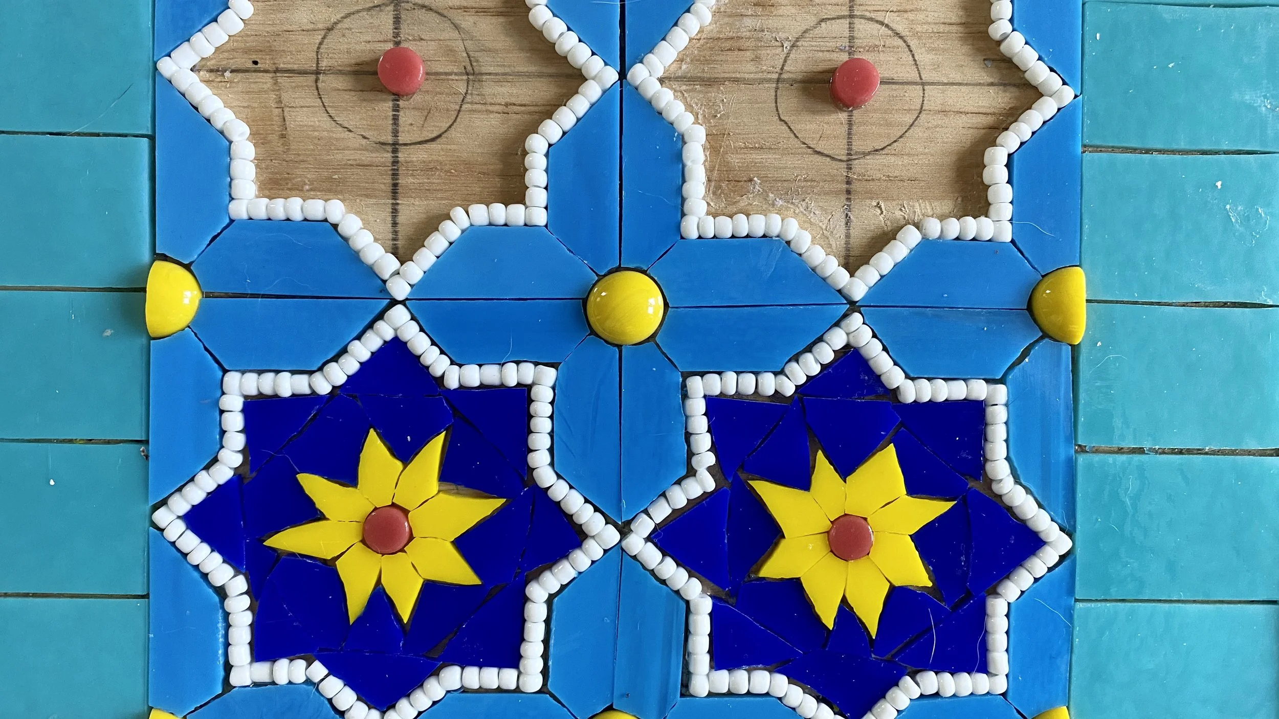
Next I’m going to take a little break from those blue pieces because it’s getting a bit tedious. I’m placing some little Kismet round tiles in the upper portion of the archway. I’m really loving the way these are looking. This section should turn out a little more delicate than the rest because of the curvy design.

I’m all over the place now. I want to lock down the designs and patterning for each section, so I’m going to place whatever I can that is quick that allows me to then make decisions about the rest. Here I’m doing some of the beading work and placing the little yellow and red circles around the whole mosaic.

Next I’ll do a little cleanup and place the red squares and yellow circles in the center.

I know I need to get a little green in this mosaic, so I’m going to place the teardrop details around the two corner pieces. These are just green stained glass that I’ve cut into teardrops and surrounded by white beads.

Now it’s time to set the pattern for the center. I know I want to outline the sections in white beads, and the center tiles of the pattern in cobalt blue.

It’s going to take me a while to set this patterning, so I want to talk about why I chose to use beads. I want the crisp outlines you see in ceramic tile. It’s hard to do this with stained glass because glass doesn’t cleanly cut into 3/16” strips. Beads may be time consuming, but I can lay them down exactly how I want them, and the color will be consistent. Stained glass also tends to have dark shadows, so when you cut it super thin, the color can be inconsistent.

The white beads look overwhelming when I first lay them down, but they mellow out quite a bit once they’re surrounded by the rest of the glass. In addition, I’m using cobalt blue grout, so they will tone down a lot once they are surrounded by & slightly buried in the grout.

Next I’m going to use vellum to make some templates for the stained glass in this middle section. I’m just going to make this one square first to set the pattern idea, but if I make the templates now, it will be one less step in a couple months when I finish all the beading and I’m ready for the glass.

I estimate by the time I finish the beading, I’ll have invested at least 300 hours into the project, and that the whole project will take about 500 hours. I haven’t really been keeping track, which I regret, but it’s hard to do the work, let alone keep track of all the videos, images, and time yourself on top of it.

Here’s the mosaic so far. There’s still a lot of work to do, but it’s starting to come together.

Let’s get a little work done on one of the two featured circles. I want to know how the orange I’m planning is going to look with the orange I’ll be using in the center.

I’ll also finish up the blue pentagons on this side while I’m over here. All these robin egg blue pentagons need to be placed before I place the white star beads. I’m going to do this row, finish all the rest of the beading, then come back and finish up the left and right side.

I don’t know why these blue pieces feel so tedious to me, but they do. I’ll be much more motivated when I know I’m closer to the finish line.

And then I’ll finish the green teardrops and surrounding beads on the other circle before moving on to the never-ending task of placing the outlining the beads in the middle sections.

Onto the white beading for the upper archway. This is my favorite part of the mosaic. I love how the flowers come together to form a second pattern in between. This is my favorite thing about this type of ceramic tile in the first place; the way the designs from each tile come together to form a pattern when they are put together as a whole.

Right now the plan is to fill in the flowers with the yellow circles with orange and the designs with the orange circles with green. This may change. It will be the last thing I do because it will allow me to change my mind if a different color will help pull the whole piece together.

For the outer border I’m going to place three concentric rows of beads in kind of an ombre color scheme. This is a chance to add something different and a little more delicate to these outer rows.

I’m going to surround the beads with yellow triangles to make it kind of a sun pattern. Right now the plan is to fill in the background with cobalt blue to ground the project, but I’m going to hold off until later to see if I change my mind.

I’m just going to skim through placing some of the beads in the middle archway section. So many beads!! It felt never ending. I’m I’m just going to skim through with a few clips of placing the beads in the middle archway section. So many beads!! I’m really happy with the way it looks and I think it is worth the time investment, but there was a point at which I thought I would be 86 and still placing these beads.

Now the majority of the beads are in place. Just about another 30 hours of beads left and I can move onto the stained glass.

There’s a lot of work left but unfortunately I have to put this mosaic aside for a while to work on commissions and other projects. I will be coming back to it and sharing it with you when I do. Thank you for watching!

VIDEO: Afghan Blue Mosque Mosaic: WIP #2

This is the second video about the creation of my Afghan blue mosque mosaic.

Video transcript for deaf or hard of hearing:

Hi Mosaic Aficionados! Here I’m going to continue work on the Afghan Blue Mosque mosaic. Now that the basic structure of the mosaic is laid out, I’m going to start on the first decorative tiles.

I began by making a vellum template of the 8 point star design I chose for this section. There are 60 identical tiles in this section, so this will help keep them fairly uniform.

I remembered while sketching out this section that I wanted to put bold yellow circles in the corners. To make these, I created bars using the cutting mat you’ve seen me use before, then used the glass cutter to cut them into slight wedges instead of squares. Then I just placed them into the circle so they fit snuggly together.

I skipped ahead a bit here… I was doing a little trial and error to see what materials I wanted to use, how I would create the cuts, and in what order I wanted to lay out the glass. Since this project is all about repetition and consistency, I want to create a strategy first so that all the tiles come out looking pretty uniform.

I decided the one place I’m not going to try to get super precise is the yellow flower at the center of the design. I figure that it will give it the handmade touch that all mosaics need.

Really, to cut those little pieces into identical microscopic elongated pentagons would be ridiculous and almost impossible, so I’m justifying with the “handmade touch” statement.

I  wasn’t really happy with how close in color the turquoise and blue of the tile background is, so I was really lucky that when I stopped at the Wissmach glass factory I found a perfect blue. It’s hard to see the difference because they’re so close in color, but it will make a big difference in the mosaic.

Here I’m cutting the new blue into 7/16 of an inch bars on the cutting mat so I can swap out that color. That will allow me to cut them into 480 rhomboids to fit around the stars.

Next I need to remove the old blue glass. I lightly sprayed those pieces with water, then I chiseled them out as delicately as possible so as not to disturb the rest of the glass, especially those tiny little beads.

Then I put in the new glass pieces. It’s pretty hard to fit them around the white beaded stars, so I’ve decided to change the order for how I create the rest of this section. I’m going to lay out the background rhomboid bars first, then place the beads inside.

This way is working much better! Not only is it easier and quicker, but then the edges of the blue glass are crisper because I didn’t have to trim them with mosaic wheels.

Next I just need to lay out the glass beads in the interior of the star. This part is also easier because of placing the blue glass first, so I became full of hubris and thought I could lay down the glue for the entire star first.

It’s still not that much easier. I had to wipe up half the glue because it was getting too dry.

Now I know for the rest of the stars.

So then I just need to place my yellow flower and tthe cobalt blue glass around it. You’ll notice that I am being pretty loose with the placement of the cobalt. This is because I’m going to use cobalt grout, so precision of these pieces is unnecessary.

I timed myself making these sections and it will probably take about 66 more hours to complete this section. It’s mind numbing for me to think about having to do all this repetitive work, so if I show you, it will be a super compressed time lapse.

I appreciate you too much to bore you with watching the same thing 60 times.

Before I go today, I just want to show you where I left off for the day, which was putting the glass gems and circles in place in this section so that they won’t be moving around when I’m trying to place the rest of the glass tomorrow. Thank you so much for watching!!

VIDEO: Afghan Blue Mosque Mosaic: WIP #1

The first video about the creation of my Afghan blue mosque mosaic.

Video transcript for deaf or hard of hearing:

Hi Mosaic Fans! Today I’m going to introduce to you my art book idea. I’ve started a few small steps in the last couple years. The concept behind this book is based on the Owen Jones book The Grammar of Ornament, first published in 1856. I’ll get into details about the book in a moment.

For the first step, I wanted to create a mosaic based on the cover of the book. It has been in constant publication for over 150 years, so there have been several covers and I went with this gorgeous gold leaf on leather version.

When I had some spare time between commissions I made this mosaic based on Grammar of Ornament’s amazing art deco book cover design. I used Van Gogh glass and the background is all super black tinted grout to give it a matte feel like the leather book cover and let the bronze and silver glass shine.

Now I want to discuss the interior of The Grammar of Ornament. Jones wanted to create a book that discussed architectural ideas and motifs from around the world. The result was a book that even modern day designers have on their bookshelves over a century later.

My original idea was to follow the same format and recreate all the designs from the book into mosaic. I eventually realized this wasn’t going to work. A lot of the designs just don’t translate well into the mosaic medium, and there is also the cultural shift, such as the problematic use of the phrase “savage tribes”.

Instead I’m choosing art forms around the world that I would love to translate into mosaic. I started by making a list of countries in the world organized by geographic area. I just pick a country, do some research, and find some traditional art, design, or architecture that I want to translate into the mosaic medium.

My first geographic find is located in Afghanistan, in the city now known as Mazari Sharif. It is the architectural marvel, the Shrine of Hazrat Ali, also known as the Blue Mosque. The blue mosque was completed in 1481. Fortunately the mosque has been able to survive all the turmoil of Afghanistan, even though the city of Mazari Sharif has been occupied at times by both Russia and the Taliban.

The mosque is considered an oasis of peace, not only because of its beautiful architecture and tile work, but because the mosque is surrounded by thousands of white doves.

Since I’m focusing on patterning, I’ve decided that my mosaic design will be inspired by one of the archways. Here is the loose idea of my design I created in Pixelmator Pro. I will follow the structure, but I just put enough tile design in to make sure I like the layout and will make more choices as I work.

Next I collected images of tile designs used at the Blue Mosque so that while I’m creating the mosaic, I’ll have ideas to choose which ones will look best. Another factor in choosing patterns is which ones will be able to translate well in the mosaic medium. Each of the tiles will be only about 3” in my mosaic, so some patterns like this one may be too intricate to really look good.

I will start by using the t-square to lay out a grid on my 4’ square plywood substrate. I will be using turquoise glass to create the frame, or solid structure of the mosaic, so I’m going to start by cutting those pieces.

I’m using the grid cutter to cut all the pieces precisely. Each turquoise rectangle is 1-1/2” x 1”. I will need over 300, so I’m turning myself into a rectangle making factory. I’m using the t-square again to line up the pieces as straight as possible. I’m coating the entire back of each piece to seal it so the grout doesn’t seep underneath.

I made a mistake here and placed the horizontal row on top of the vertical rows when it should go one grid space lower in between the vertical rows. I’m spraying the row with water to loosen up the glass and I’ll move them down into their correct spot. Here I just need to sketch the diagonal lines and create the top of the archway.

Now I have the structure complete for the mosaic. I can’t wait to show you more as the mosaic progresses! Thank you for watching!

Bodhi Tree Mosaic

The client for this mosaic came to me after she had purchased pottery from an artist in Africa. Unfortunately, the pottery broke during shipping, so she wanted me to make a mosaic artwork with the shards as a memory of her trip.

My client told me about her amazing trip to Africa (it’s been several years so I forget which country) and how she buys local artwork every time she travels. She was very excited to have this gorgeous pottery set as a memory of her time. The artist offered to ship it to her, and sadly it arrived with almost every piece broken. Her friends suggested she make a mosaic out of the shards. She decided that she wanted something more “fine art” than what she could do herself, so she asked me to help.

The pottery was beautiful, as was her story, so of course I wanted to help. I asked if she wanted to incorporate other glass or tile too, but she wanted to use exclusively the ceramic pottery. I came up with the idea of the design, which she liked. Then I found these Walker Zanger pop art porcelain tiles and realized how amazing and special they would look in this mosaic. I told the client I absolutely understood why she wanted to use only material from her trip, but offered her these as an option in case she wanted to reconsider. She loved the way they looked and how they organically fit with the pottery, so we went for it!

When I created the mosaic, I used the rims of the cups, bowls, and plates for the leaves and branches. I layered the ceramic for a three dimensional effect. For the background, I used the centers of the pottery. I decided on a simple brickish type pattern to give a sense of zen and to make a distinct change in andamento between the background and foreground. I loved how in the background, the different thicknesses between the dinnerware provided depth and texture.

I developed achy hands and a lot of blisters trying to cut this very hard, thick ceramic. It also had a tendency to crumble, which was incredibly frustrating. I stilled loved the opportunity to make this very special artwork, and the client loved it. So overall, absolutely worth it!