This medium sized mosaic was created for Delta Airlines in 2014. Delta had assigned a national theme for each artist and they choose Mexico for me.
There are many different ways to lay out our three dimensional planet on a two dimensional map, so they wanted to make sure all the artworks in the series were using the same map for cohesion. This also allowed for each artist to add their own personal touch to the world map and be able to express their creativity using their own art forms.
Most of the mosaic was created organically with the exception of Delta giving me the map to use for the mosaic. This piece was part of a series in which they had artists from different cities create a map in different mediums and they then featured a new one every month for their inflight magazine.
For this project, Delta had very specific dimensions that were necessary for their photography, so I created the mosaic on Wedi board, which is a lightweight, foam-cored cement backer board. By using a Wedi board, it could easily be cut to size and even though it was being created just for a photograph, I attached Wedi washers before I started so the mosaic could be hung at a later time
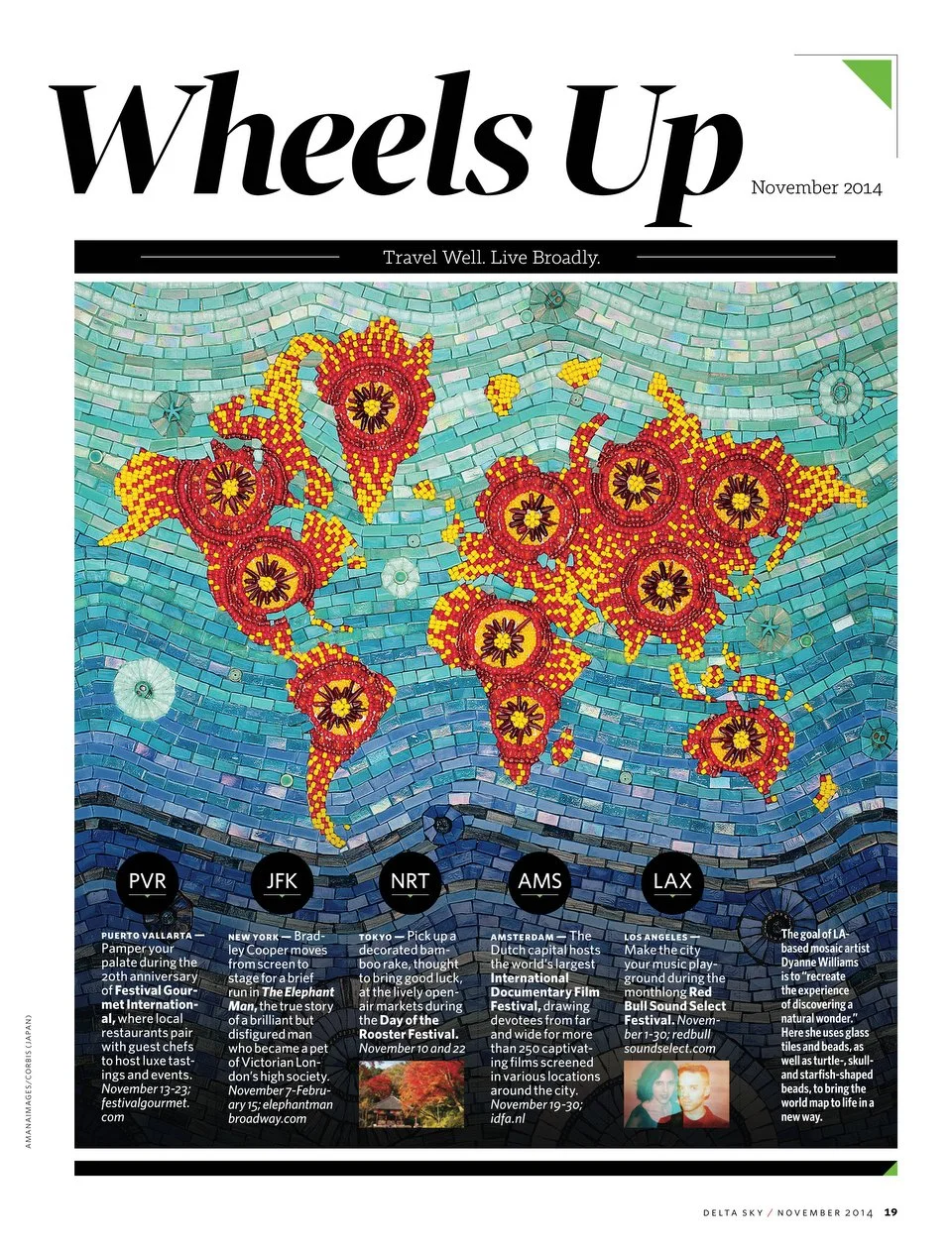
I choose to do the colors yellow and red because of the abundance of these colors in all Mexican art and their culture. Mexican artwork is filled with color, small details and they use a lot of beads as well. At this current time, I was super into beads and since beadwork is popular in Mexican culture, this seemed like a perfect fit.
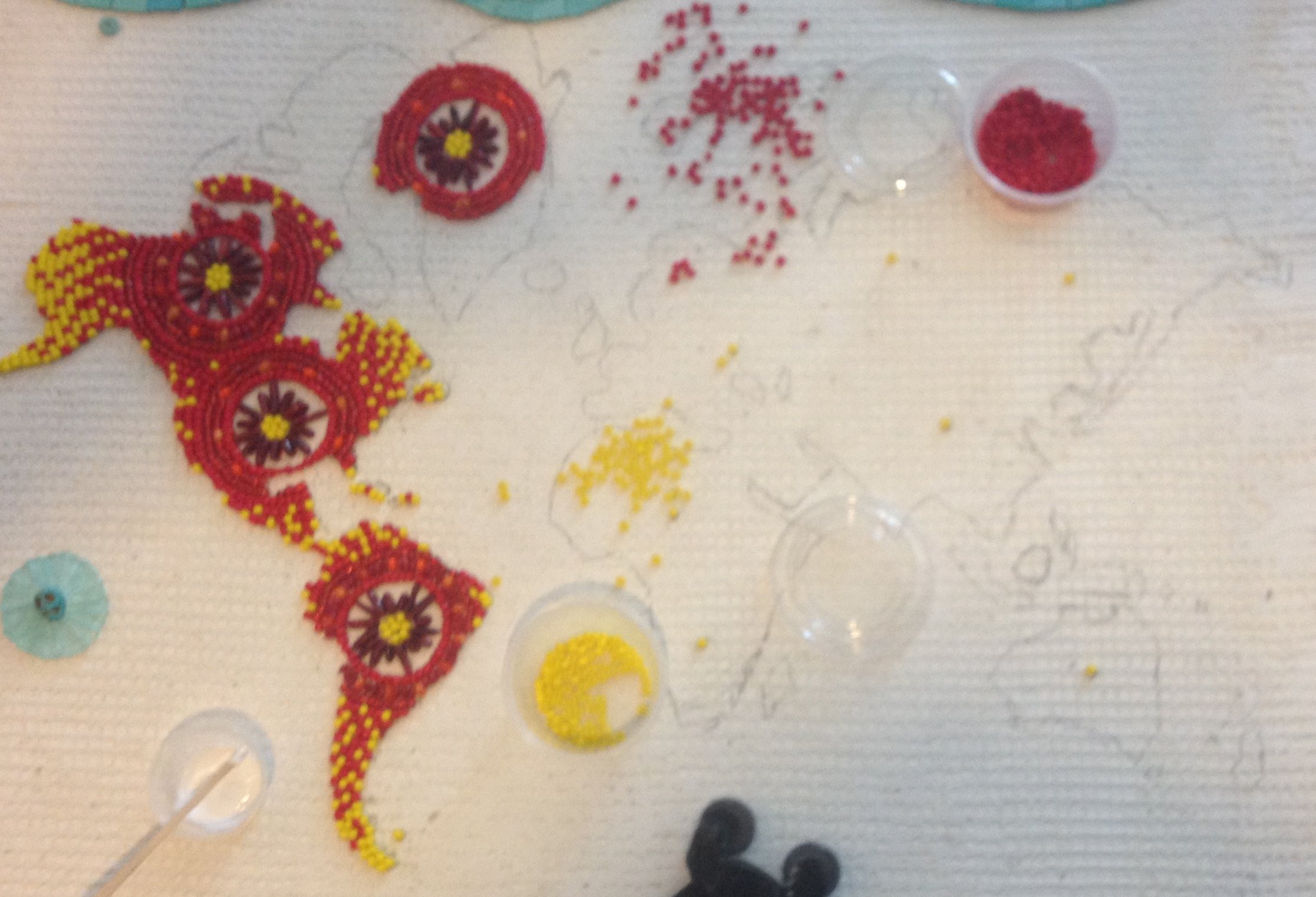
Once I came up with a plan and choose the colors of beads, I went to Michael’s to buy the beads. I needed almost 20 little tubes of the yellow beads, but each store only stocked 3 at the time. The timeline was too short to be able to order the beads online, so I spent a whole day driving to every Michael’s in the Los Angeles area, from Long Beach to Burbank. I even had to call my bank to turn my debit card back on because apparently when you make purchases at 6 different Michael’s over the course of a few hours looks extremely suspicious!

In addition to just using beads, I used glass tiles. Most of the 5/8” tiles are Sicis and the 3/4” Hakatai. I used a combination of tiles that included translucent, iridescent, opaque, and gold-streaked glass along with wavy andamento to give the impression of movement within the waves. I wanted to create this sense of movement throughout the glass blues to create the ocean and the ripple effects of the waves.
When I started to add the blue shades of tile for the ocean, I originally intended to grout the whole mosaic, however, only the type of dark red beads that were available were painted on the outside so the grout would have just wiped the paint off.
Instead of using grout, I used white silicone with the translucent light glass on the top and then Weldbond for the rest. I also used Mapei black grout for just the bottom portion of the mosaic which included the darkest shades of blue.
I thought of a pattern that flowed from red to yellow would be beautiful, but I mostly wanted red to be the star too because I like red better then yellow and it’s also a complimentary color to the ocean blues that I am using. Just when I started to place the red beads and slowly started adding the yellow, I could see the map come along and it was easy to identify that I was creating North and South America.
Upon completion of my project, I took it to Studio Q photography where Yuno Cho placed in under a LED light box, and this helps so that the lighting can then be diffused and there would be no odd white or dark spots on the photograph in the end result. I really wish I could have all of my art professionally photographed in this way! Professional photography is very expensive... but it if for sure worth it if you can do it! Your artwork will truly benefit from it!
